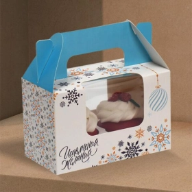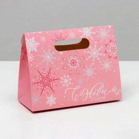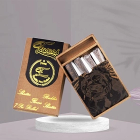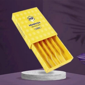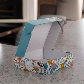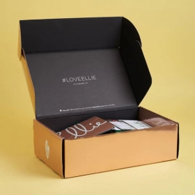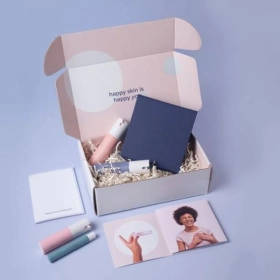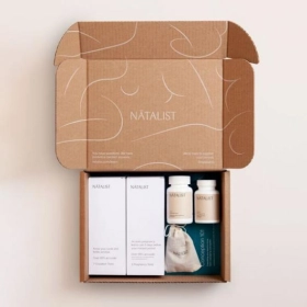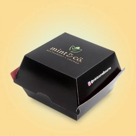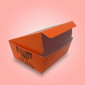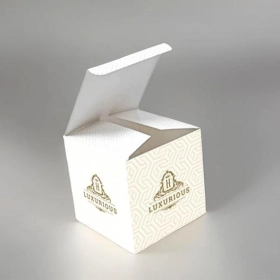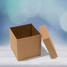





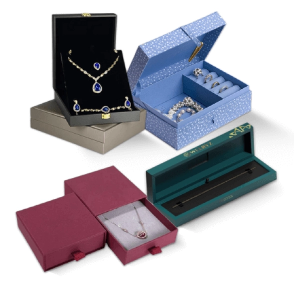
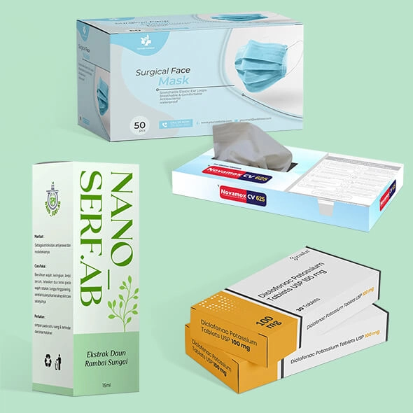
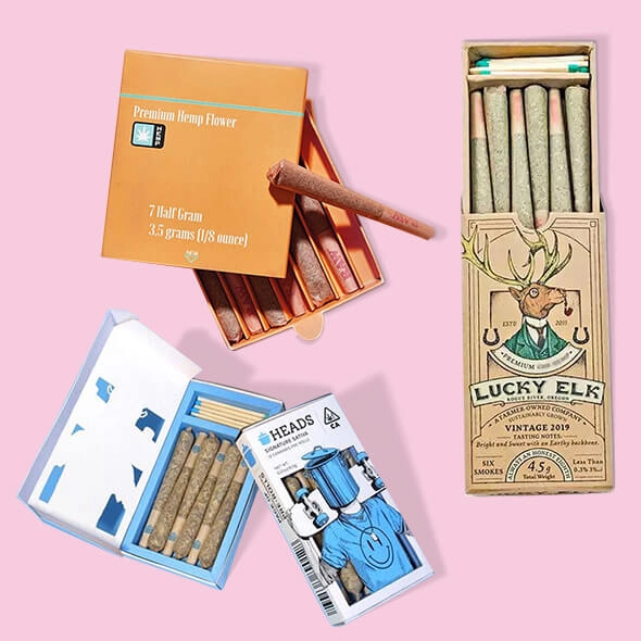
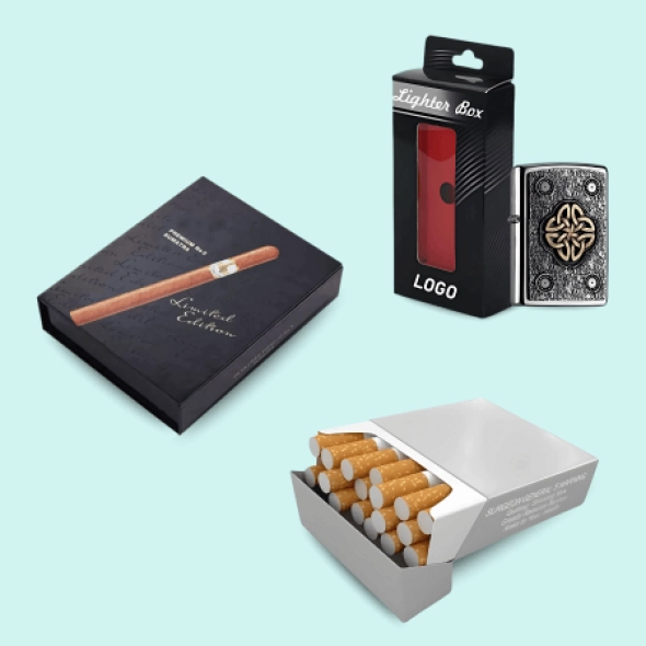
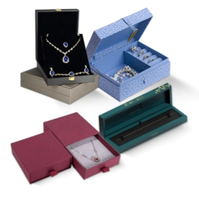
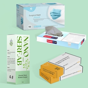
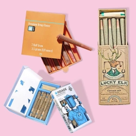
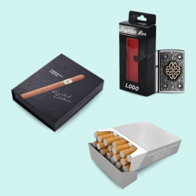












| Box Style | As Mention Above |
|---|---|
| Dimension (L + W + H) | All Custom Sizes & Shapes |
| Minimum Run ( For Boxes and Mylar Bags) | 100 Boxes - 1000 Mylar Bags ( 500 each design) |
| Paper Stock | 10pt to 28pt (60lb to 400lb) Eco-Friendly Kraft, E-flute Corrugated, Bux Board, Cardstock |
| Printing | No Printing, CMYK, CMYK + 1 PMS color, CMYK + 2 PMS colors |
| Finishing | Gloss Lamination, Matte Lamination, Gloss AQ, Gloss UV, Matte UV, Spot UV, Embossing, Foiling |
| Included Options | Die Cutting, Gluing, Scored,Perforation |
| Additional Options | Eco-Friendly, Recycled Boxes, Biodegradable |
| Proof | Flat View, 3D Mock-up, Physical Sampling (On request) |
| Turnaround | 7 - 8 Business Days |
| Shipping | FLAT Position |
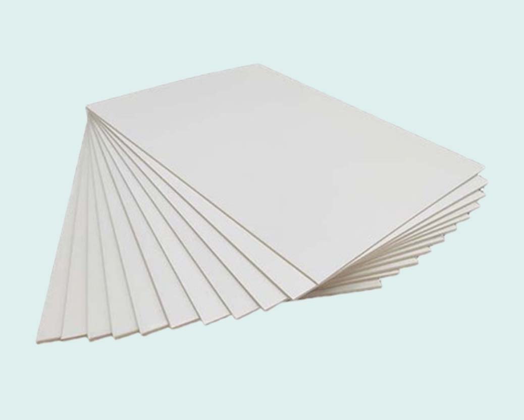
We use eco-friendly cardboard materials designed to minimize environmental impact and reduce waste.
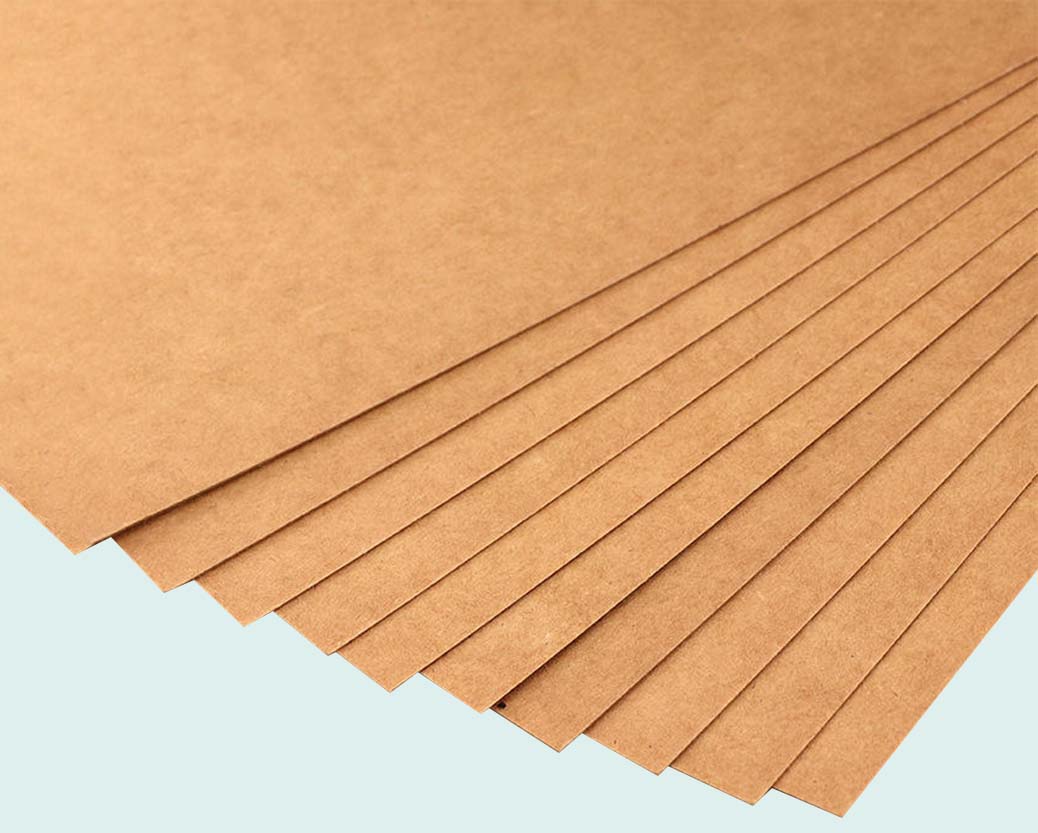
Kraft paper is a sturdy, durable, and dependable material used across multiple industries.
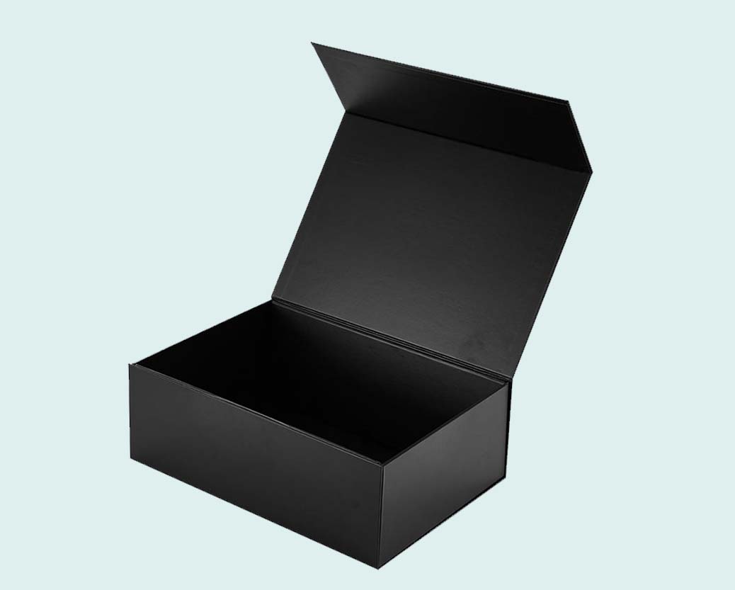
Rigid material is highly protective, cost-effective, and recyclable, offering maximum durability and security.
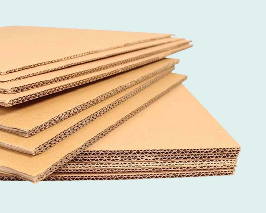
Corrugated material is customizable, cost-effective, and sustainable, making it an excellent choice for branding and shipping.
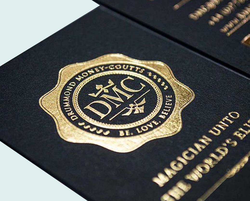
Enhance your product packaging with our premium foil stamping for a sophisticated touch.
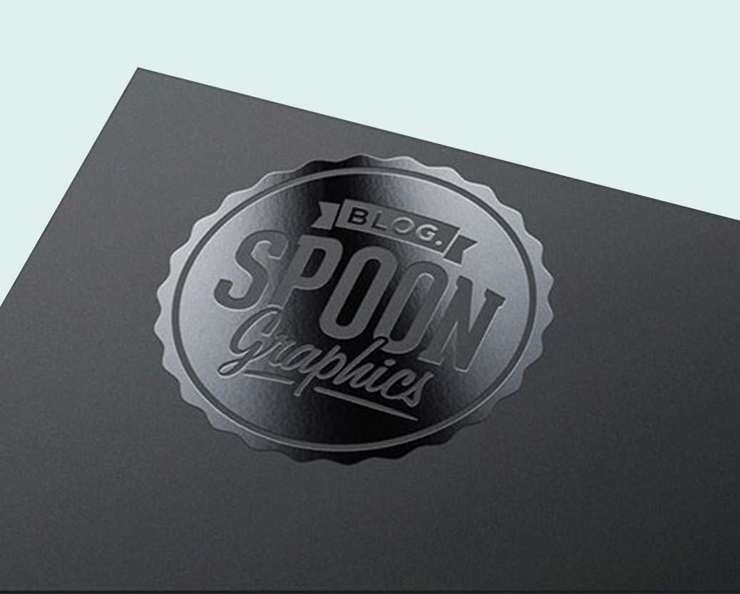
Our high-gloss UV coating enhances shine and provides a sleek, protective finish to your printed materials.
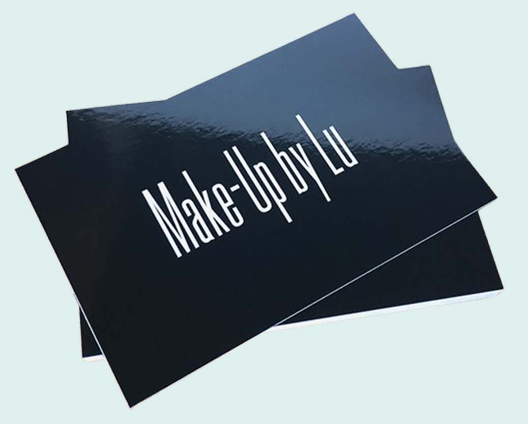
Our glossy finish adds a sleek, eye-catching shine to your packaging.
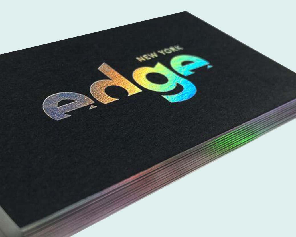
Holographic foil refracts light, creating a stunning rainbow effect from different angles.
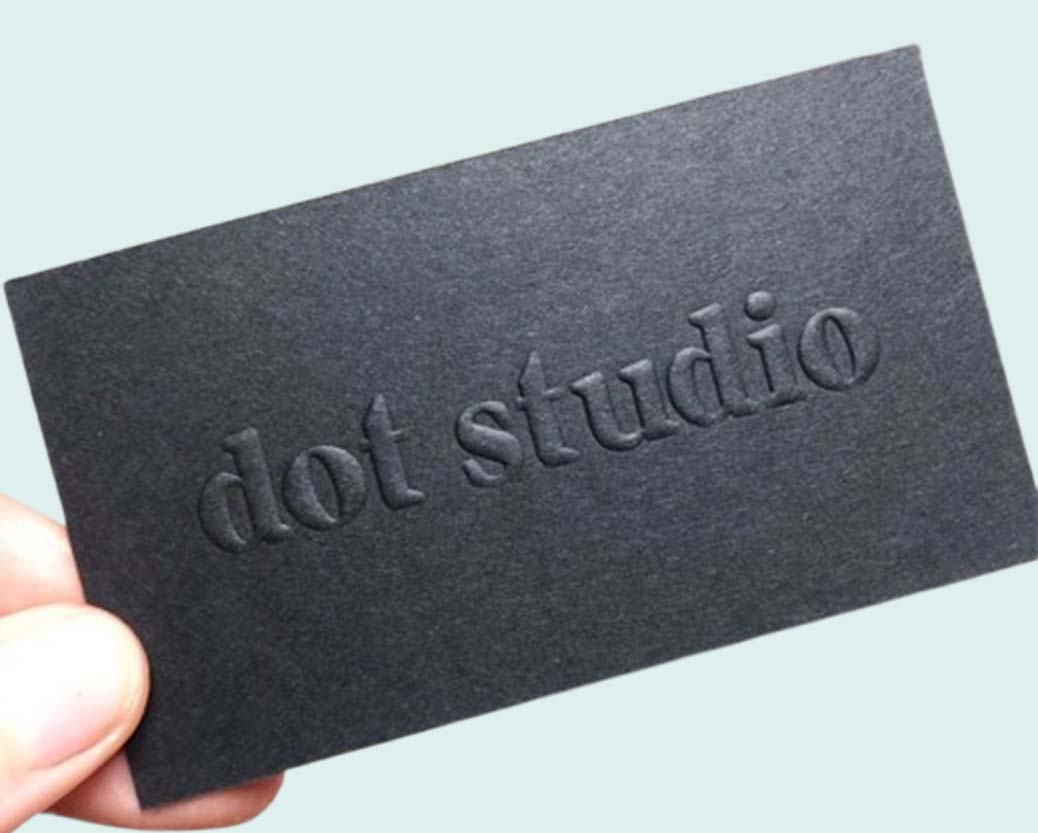
Our embossing technique captures the finest details, adding depth and elegance to your packaging.
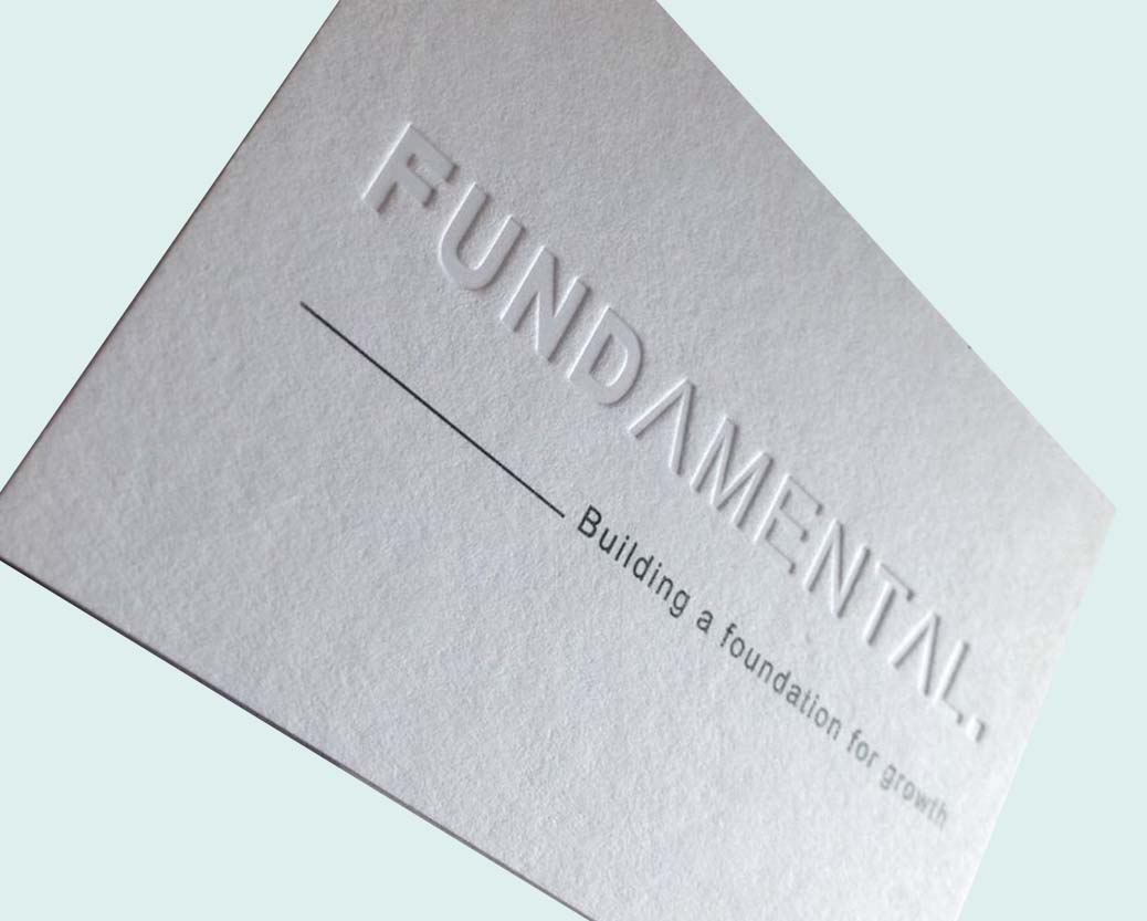
Our debossing technique imprints unique graphics into your packaging, creating a refined and tactile effect.
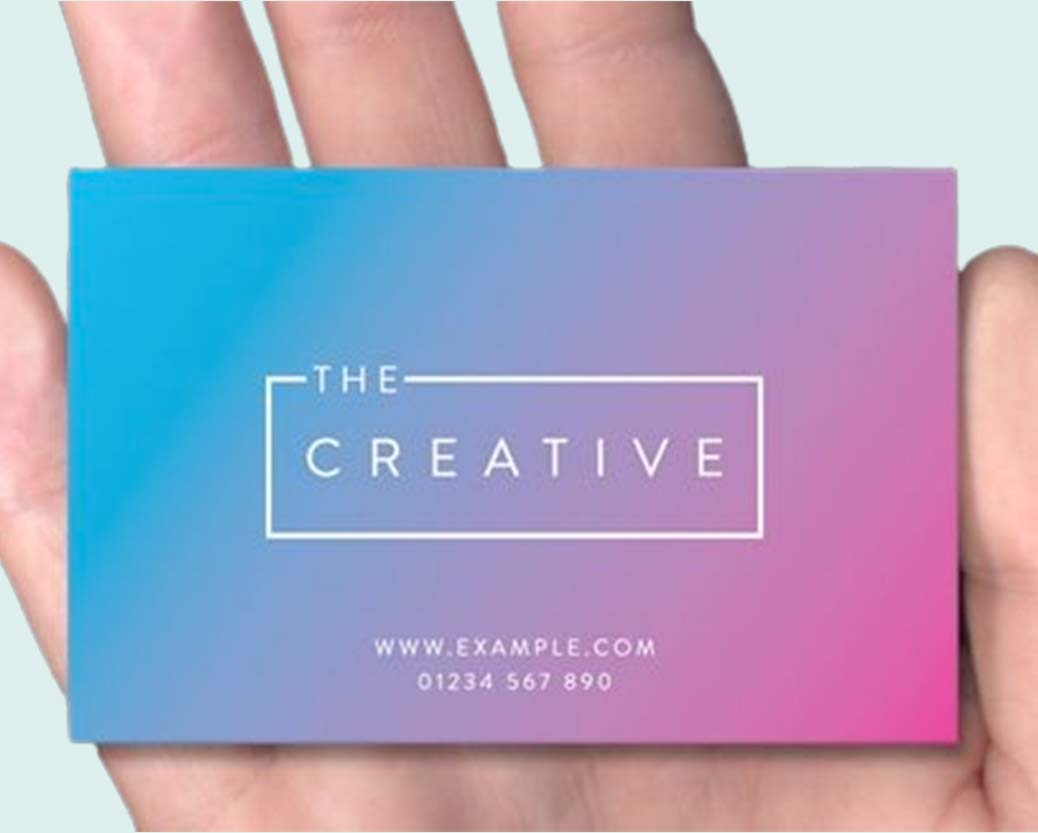
Our matte finish reduces the visibility of fingerprints and smudges, keeping your packaging looking clean and refined.
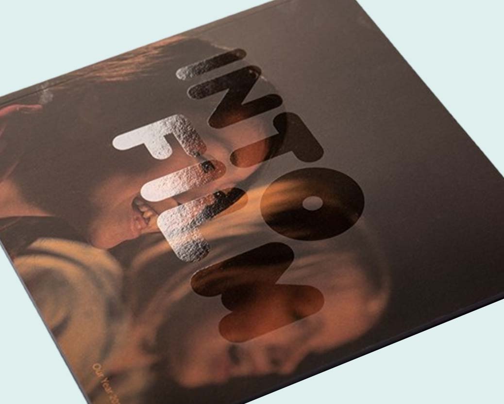
We apply a soft-touch lamination that adds an extra layer of protection, preventing toner chipping.
For whoever is making the artwork
Downey sits inside one of the densest concentrations of small manufacturers, food producers and beauty brands in the country, which means a lot of businesses here have a designer already, or a founder comfortable in Illustrator. The problem isn't design ability. It's that print has a set of technical requirements that never come up in digital work, and nobody mentions them until a file gets rejected.
This page covers those requirements. Follow it and your first file passes preflight, your proof comes back correct, and you don't lose a week to revisions.
Rule one: design on the dieline, not a rectangle
A dieline is the flat, unfolded map of your box. Every cut line, fold line, glue flap and perforation, drawn at exact size.
Artwork designed on a plain rectangle and then dropped onto a real dieline usually breaks in the same predictable ways. The glue flap eats a third of the back panel. A logo lands across a fold. The top tuck flap, which nobody thought about, is blank. The dust flaps, which are visible when the box is open, are blank too.
Ask for the dieline before design work starts. We supply it free with every quote, as a layered vector file, along with a 3D mockup so you can see what the folded box looks like before committing. Design onto that layer, and the geometry problem disappears entirely.
The three lines that matter
Every dieline has three boundaries, and confusing them causes most print rejections:
Trim is where the blade cuts.
Bleed is the area past the trim line. Any background colour, image or pattern that runs to the edge must extend at least 1/8 inch (0.125") past the trim. Cutting has a small tolerance, so without bleed you get a thin white sliver along one edge. This cannot be fixed after printing.
Safe zone is the margin inside the trim. Keep text, logos and anything you can't afford to lose at least 1/8 inch, ideally 1/4 inch, inside the trim line. Type sitting right on the edge will look cropped on some units of the run even when it looks fine on the proof.
A quick way to sanity-check any file: does the background go past the outer line, and does the text stay inside the inner one?
Why the colour on your screen isn't the colour on the box
This causes more disappointment than anything else in packaging, and it's entirely avoidable.
Work in CMYK, not RGB. Screens emit light and cover a wider colour range than ink on paper. A vivid RGB blue, orange or green frequently has no CMYK equivalent, so it converts to something duller. If you build the file in RGB and let the printer convert it, you find out at proof stage. If you build it in CMYK, you see the real colour while you're still designing.
Use Pantone spot inks for brand-critical colours. A CMYK simulation of a brand colour is four inks approximating one, and it drifts between runs and presses. A spot ink is mixed to a formula and repeats reliably. We print CMYK plus one or two PMS colours, so if your logo has to be exactly right, specify it as a spot.
The substrate changes the result. The same ink prints differently on white cardboard, on brown kraft and on a recycled stock with a warmer base. Kraft in particular mutes colour noticeably, because there's no white ground under the ink. If you want vivid colour on kraft, you need a white underprint, which needs planning.
The finish changes it too. Gloss lamination deepens and saturates. Matte flattens. Soft-touch flattens further. Choose the finish before you approve colour, not after.
Rich black, fine text and ink limits
Large black areas printed with 100% K alone look washed out and grey. For solid black panels use a rich black build, roughly 60C 40M 40Y 100K, which gives real depth.
The reverse applies to small text. Black type set in a four-colour build needs all four plates to register perfectly, and any tiny misalignment shows as coloured fringing. Set small black text in 100% K only.
Also watch total ink coverage. Adding up all four channels in the darkest area of your design should generally stay at or under about 300%. Beyond that, ink stops drying properly and can set off onto the next sheet.
Special finishes need their own layer
This is the step people miss most often. Spot UV, foil stamping, embossing and debossing are not effects you apply in the design file. They are separate production passes, and each needs its own artwork.
Supply each as a separate layer, in solid 100% black vector, named clearly — "SPOT UV", "FOIL", "EMBOSS". Everything on that layer gets the treatment; everything off it doesn't. Grey tints don't work, because there's no such thing as 50% foil. Gradients don't work either.
Two practical notes. Fine detail doesn't survive foil or emboss well, so hairline strokes and small serif type tend to fill in or tear. And check your overprint settings: white objects set to overprint will vanish on press, because white ink isn't being printed at all, the paper is just left bare.
Images, fonts and file format
Raster images at 300 DPI at final printed size. A 300 DPI image scaled up 200% is really 150 DPI and will look soft. Check effective resolution, not file resolution.
Convert fonts to outlines, or supply the font files. A font that isn't embedded gets substituted, and you find out on the proof when your headline is in a different typeface.
Send a print-ready PDF with bleed included, plus the native file (AI, PSD, CDR, EPS or SVG) so we can make corrections without rebuilding. We also accept JPG and PNG, and if all you have is a logo or a rough layout, our design team builds the artwork for you at no charge.
Planning bilingual panels
A large share of Downey's consumer base is bilingual, and a lot of local food, beverage and beauty brands run English and Spanish on the same package. Worth planning for at the layout stage rather than retrofitting.
Spanish typically runs longer than the equivalent English, often by fifteen to twenty-five percent. Copy that fits comfortably in English will overflow its panel in Spanish, and shrinking the type to compensate is how you end up with an unreadable side panel.
Three things that help: allocate the space based on the longer language, not the shorter one; give each language its own clearly separated block rather than alternating line by line, which is hard to read in both; and have a fluent speaker review the final copy rather than relying on machine translation, because product and ingredient terminology is where automated translation fails most visibly.
If the box will carry two languages, tell us at quote stage. It sometimes changes the box dimensions or panel arrangement we'd recommend.
What to check on the proof
Your proof is the last point where a mistake is free. Check, in this order:
Spelling and numbers, read aloud, by someone who didn't write them. Then that every panel has the content it should, including tuck flaps and dust flaps. Then that the barcode, if you have one, sits flat on a light background with clear margin either side. Then that nothing important sits within 1/8 inch of a trim or fold line. Then that your finish layers cover exactly the elements you intended.
If exact colour matters, request a physical sample rather than approving from a screen. A digital proof shows layout accurately. It cannot show you colour, because you're viewing it on a backlit display.
Preflight checklist
- Built on our dieline, at 100% size
- CMYK colour mode, spot colours specified by PMS number
- 0.125" bleed on anything running to the edge
- Critical elements 0.125–0.25" inside the trim
- Images 300 DPI at final size
- Fonts outlined or supplied
- Rich black for large solids, 100% K for small text
- Total ink coverage under ~300%
- Finish layers separate, named, 100% K vector
- Dieline layer left in place, not deleted
Serving Downey and the Gateway Cities
We supply businesses across Downey and the surrounding LA County area, including Norwalk, Bellflower, Paramount, Whittier, Bell Gardens and the Commerce and Vernon manufacturing corridor, with free delivery on quoted orders. We work online rather than from a Downey facility, so files, proofs and approvals run by email, phone or the quote form on this page.